Overview
The
challenge
The current interface is not user-friendly, as it poses problems with login, navigation, and functionality. The limitation to buttons as the only form of navigation hinders efficiency and detracts from the user experience.
The main challenges were to adapt existing systems to improve functionality and operational efficiency, customize technological solutions to optimize the user experience, and establish clear processes.
Our goals were to improve the accessibility and usability of Mi Argentina by redesigning the interface, removing the restriction to buttons, prioritizing intuitive navigation, and increasing efficiency and user satisfaction by simplifying procedures and presenting personalized information clearly.
Design Process
How I
built it
A full Design Thinking cycle — from discovery through tested prototype — guided every decision. Each phase informed the next, keeping the redesign grounded in real user needs rather than assumptions.
Investigation
Surveys and interviews to understand who uses the app, how they feel about it, and where it fails them most.
Definition
Empathic analysis and user personas to translate research into concrete pain points, needs, and design challenges.
Ideation
Sitemap redesign, merging overlapping sections, and introducing new features to close gaps identified in research.
Design
Lo-fi, mid-fi, and hi-fi wireframes — including a full style tile covering color, typography, and visual identity.
Testing
Usability tests across varied age groups using both prototypes, measured with the System Usability Scale.
Discover Phase
Research
& Define
25 survey responses collected from Mi Argentina users. Questions explored usage patterns, interface issues, trust levels, and satisfaction with document management and procedure flows.
5 in-depth user interviews conducted to uncover pain points beyond what surveys could capture — particularly around navigation confusion and concerns about the safety of personal data.
Empathic analysis mapping emotional responses to specific app interactions — frustration navigating multiple options, anxiety about data vulnerability, and the need for offline access to critical documents.
Research Synthesis
Key
insights
The research pointed to a consistent set of problems: the interface undermined trust, confused users across all age groups, and created real friction around the procedures people needed most.
Navigation was broken
95.8% of users said the app didn't present information in an understandable way. 79.2% felt uncomfortable using it — a sign that core navigation patterns needed fundamental rethinking.
Trust was divided
Trust in the app split almost evenly — 41.7% sometimes trusted it, 41.7% always did, and 16.7% never did. Security concerns around personal documents, especially children's health data, were a recurring theme.
Documents are the core
The most-used sections were Documents, My Vehicles, and My Health. Users wanted fast access, offline availability, and clarity — not buried menus and redundant steps to reach critical credentials.
Define Phase
User
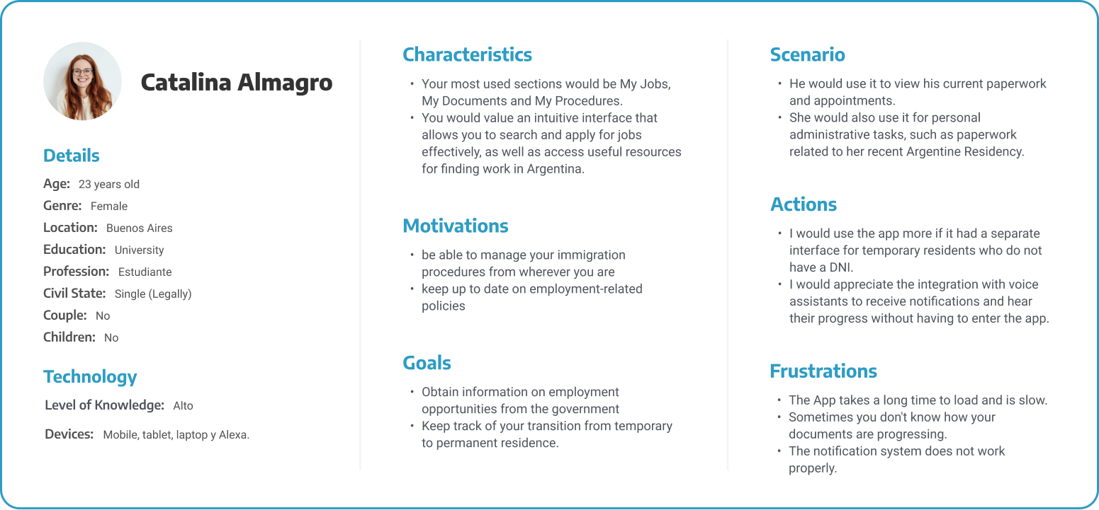
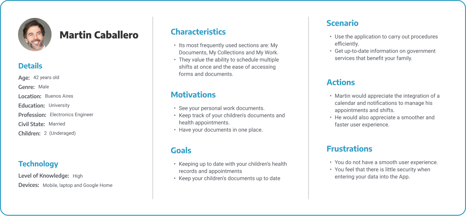
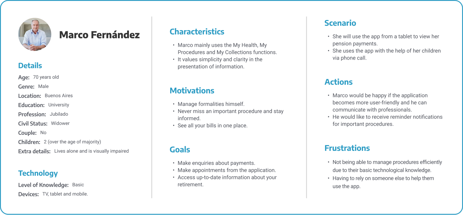
Personas
To understand users on a personal level, an empathetic analysis was conducted, ensuring that re-designs are not only functional but also emotionally satisfying. Three personas were defined ranging from 18 to 70 years old, including students, professionals, and retirees.
Ideation Phase
Information
Architecture
We designed the sitemap to meet the specific objectives and requirements of the project. We introduced new sections, such as "Migraciones" (Migrations), and merged related sections like "Mis Tramites" and "Mis Turnos" to facilitate user navigation and offer a smoother experience.
Design Phase
Design
System
For the high-fidelity wireframes, we selected a 60/40 colour balance. This implies that 60% of the interface is represented by the institutional colour, while the procedures, documents and icons associated with each section will adopt the colour corresponding to it, which represents the remaining 40%.
Color Palette
Primary
Neutro
Secondary
Typography
Design Phase
Mid-Fidelity
Wireframes
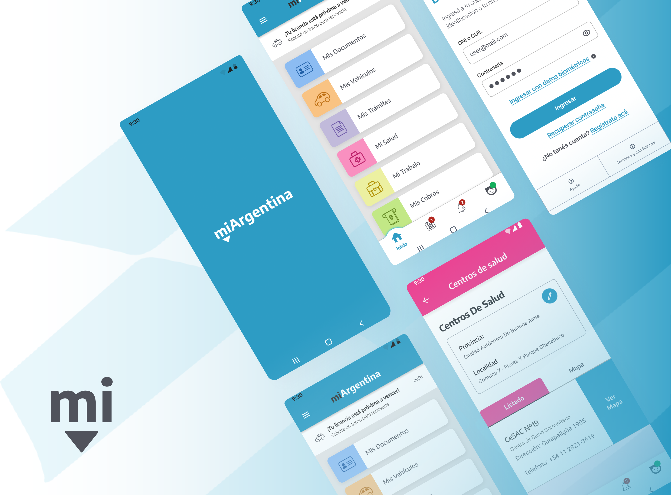
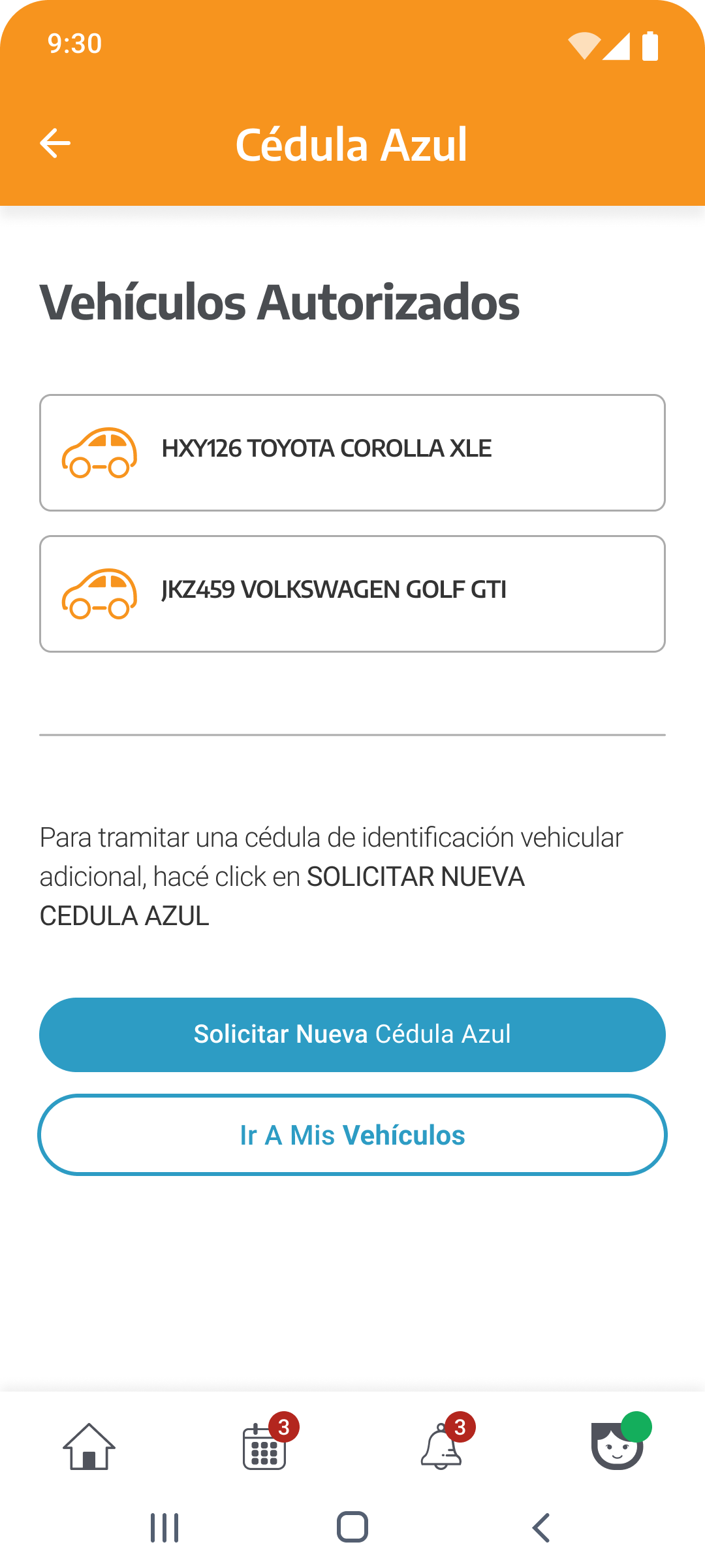
Mid-fidelity wireframes were developed to map out the core interactions. Key sections redesigned include "My Documents", "My Procedures", "My Calendar", "Migrations", "My Vehicles", and "My Health".
Main Menu
My Documents
My Procedures
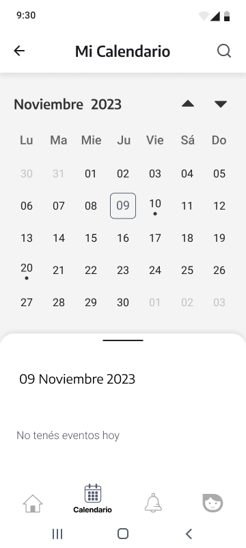
My Calendar
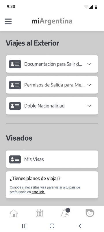
Migrations
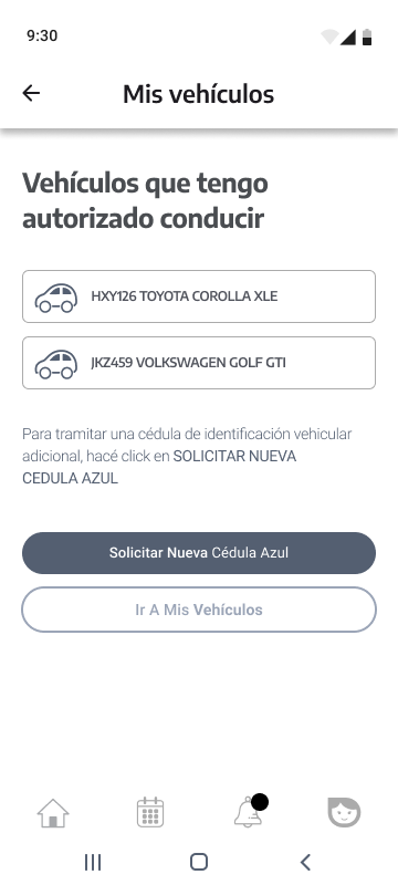
My Vehicles
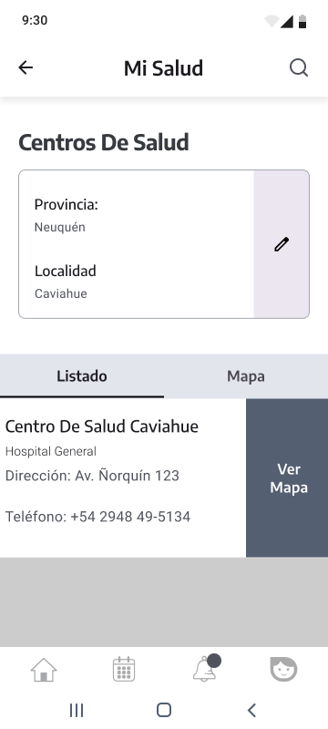
My Health
Design Phase
High-Fidelity
Prototype
The final prototype integrates the 60/40 color balance rule, applying institutional blues alongside category-specific colors to aid navigation and visual processing.
Main Menu
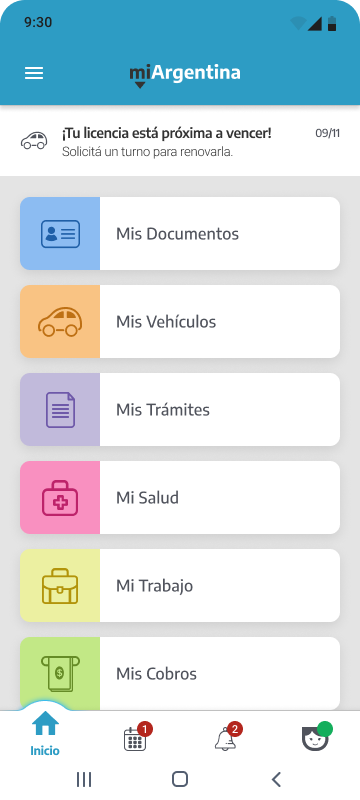
Dashboard
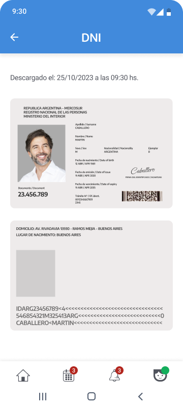
My Documents - DNI
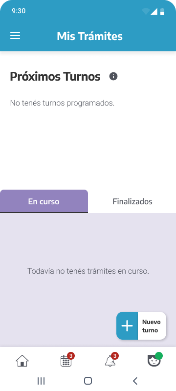
My Procedures
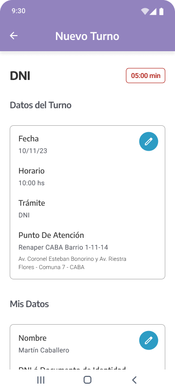
My Procedures - New Appointment
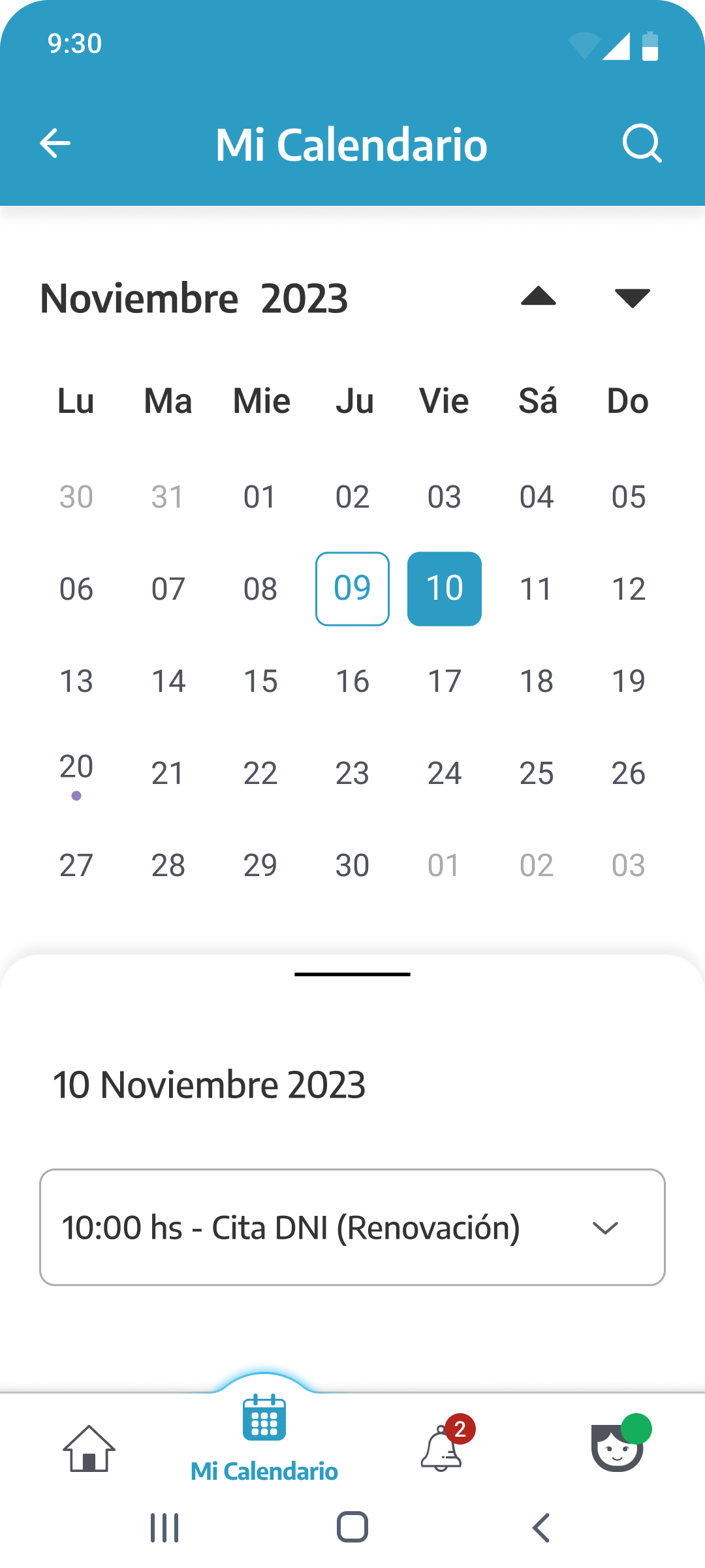
My Calendar
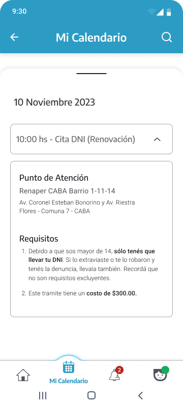
My Calendar - Appointment Details
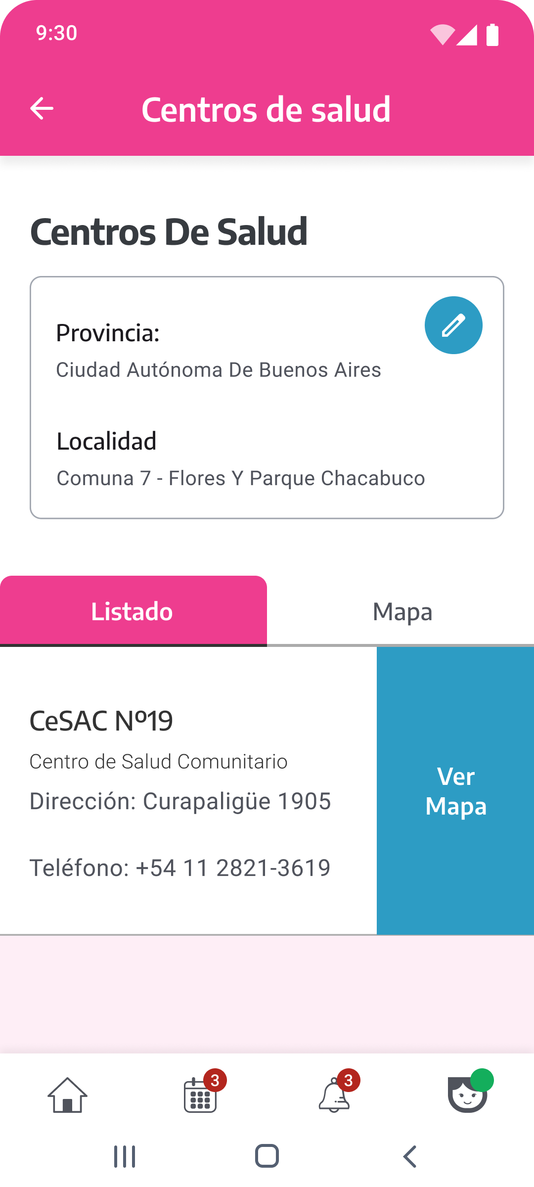
Health Centers
Vehicles
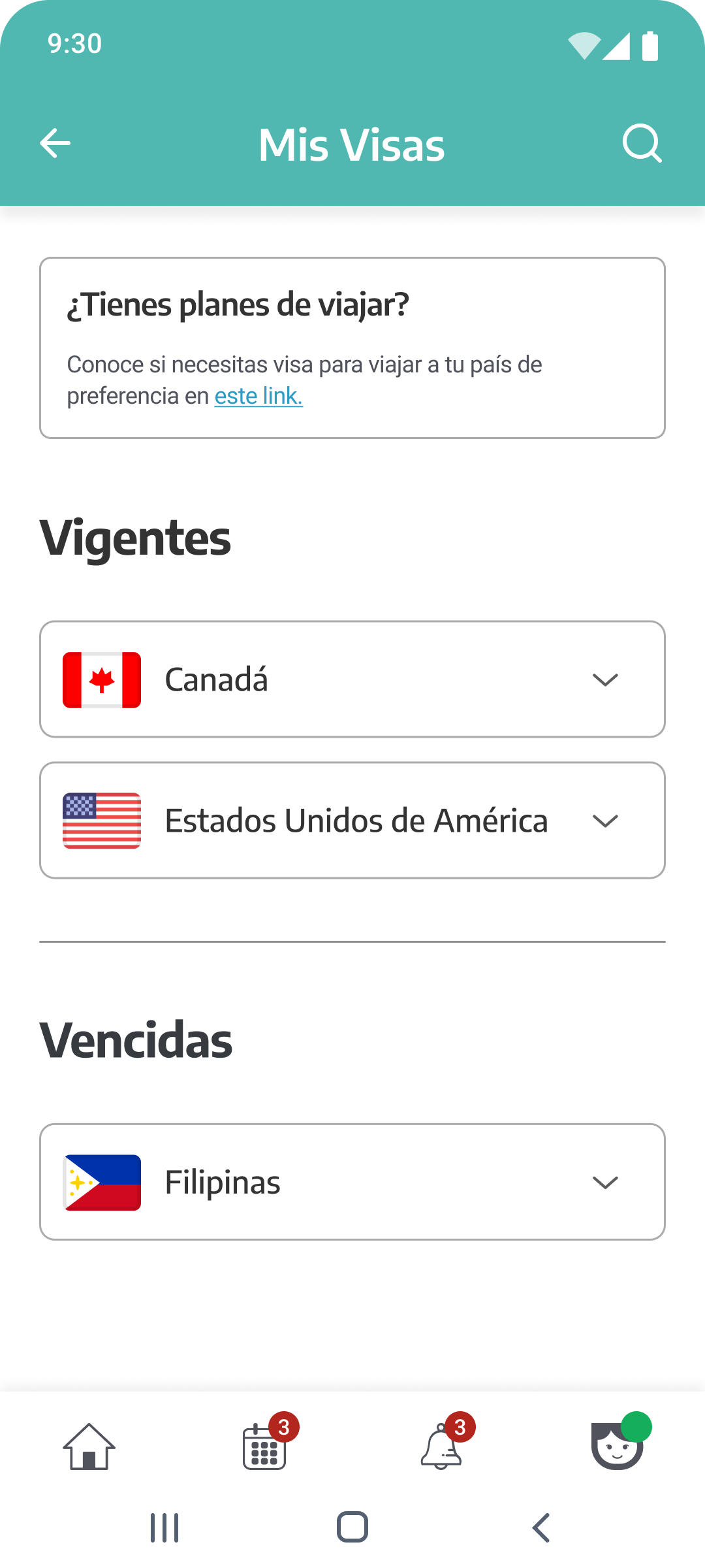
Migrations
Usability Testing
Testing
Scenarios
Usability tests were conducted with users across different ages first using the mid-fidelity prototype and later the high-fidelity one. Three scenarios were designed to cover the most critical flows — each was recorded and measured using the System Usability Scale (SUS).
Scenario 1
Entry and search for documentation and information: DNI, Blue Card and Health Centres according to location.
Scenario 2
Request and confirmation of appointment for DNI renewal. Viewing of appointments in the "My Calendar" section.
Scenario 3
Check the validity of your visa and download the document. Search for information on the departure of minors from the country.
SUS Results
What the
tests showed
System Usability Scale scores ranged from 60 to 100 across five participants. The average skewed high, confirming that the redesign significantly improved perceived usability — with the main outlier linked to one participant's lower comfort with technology in general.
Clear structure builds confidence
Users expected documents to be organised in a predictable way. Clearly labelled sections with consistent nomenclature allowed people to browse intuitively, without needing to explore or guess.
Feedback at every step
Providing visible confirmation after each action — booking an appointment, downloading a document — significantly increased users' confidence in the system and reduced second-guessing.
Restructuring improved everything
Merging overlapping sections and introducing the new calendar and migrations areas reduced cognitive load. Users completed tasks faster and reported a noticeably smoother experience overall.
Reflection
What this
project taught me
Throughout this project, I discovered firsthand the transformative power of user feedback in design. By immersing myself in user surveys, interviews, and hands-on usability tests, I gained profound insights that guided our decisions at every turn. It's incredible how centering on the user's needs can steer us toward crafting experiences that are not just efficient, but truly enjoyable.